PayFit: Employee Record
PayFit is a B2B SaaS that simplifies payroll and human resource management for all European SMEs.

Platform: Desktop Web App
PayFit is simple, trustworthy, &
requires no experts - these are what prospects think when they learn about PayFit, but in reality, with over 3,200 customer tickets within the past year, we see that Admins are not easily managing their HR tasks on the app.
We are also losing deals because prospects aren’t getting the sense that this is an HR tool.
This project is focusing on streamlining the Admin’s tasks.
My Role
The lead Product Designer working closely with a Product Manager and a developing team: leading the discovery, facilitating ideation workshops, collaborating with the Design System team, user testing, strategy planning, and delivery support.
Discover the User
Define the Experience
Designing and Testing
Prioritize the Iterations
Tools
Figma
Design System
Miro
Let’s put ourselves in the shoes of an HR Manager
If you were an HR Manager and needed to know how long an employee has been in the company or their contact information to mail them updated company policies, would you be able to see on the screen?

Current experience
We took the data from customer claims and were able to find 6 clients to interview to understand what was the main impact for them.
The common problems were:
takes a long time to find information
the information shown is not understandable
some information is missing - nowhere to be found
Testimony from an Admin user, Catherine

“I cannot find certain employee information on this app. It isn’t very easy to do certain actions. I’m a bit afraid to make any mistakes.”
Catherine, who is an HR manager in a company with 30 employees - is really busy with managing payroll to HR tasks.
She is having a real hard time finding information and is afraid to make any mistakes.
Now, what outcomes do we want to see?
Increase the customer satisfaction
How? Increase admin NPS - where they will be able to efficiently do their daily HR tasks.
Grow the revenue
How? Increase the MRR generated by HRIS Customers thanks to new deals won and upsells.
And how do we know if we were successful?
If we increased the satisfaction on Admin NPS by 50%+
to make sure our customers love our product.
Gained 80%+ new MRR
(acquisition + upsell - churn - downsell) generated by clients using HRIS in 2021 compared to 2020
Let’s focus on Catherine
Catherine, the HR manager, she does very administrative tasks, so she has to be sure that she always has the correct information to avoid making any mistakes.
To start helping her out, my PM and myself started to map out her pains and needs on a standard employee journey in a company using the PayFit app - from when they get hired to when they leave a company - because during each step of the way, Catherine is always involved in this employee’s journey where she will always need employee data.

This helped us see the overview on her pains and develop opportunities.
What should we work on now?

Exploring different solutions
1. With the PM, we reviewed our discovery and agreed on the 3 main user needs
Efficiency
Autonomy
Avoid mistakes
2. We then identified solutions to these needs and evaluated how much it would impact the customer satisfaction and revenue via all the interviews we had with sales and all the other interviews we gathered.
3. I've set up a few wireframes and had a session with the tech team to evaluate the effort of each solution.
4. We were then able to prioritize and define which solution we will work on - Employee Summary, a dashboard that highlights important employee info that is used daily.

Prioritizing and defining solutions
There’s no “i” in team
To help ideate on solutions for the Employee Summary, I conducted a Crazy 8 workshop with some stakeholders by giving them criteria on what to think about when generating ideas. The objective was to generate as many ideas and give everyone a chance to input their ideas. Then we voted on what was our favourite ideas to converge.
Learnings from this workshop
Although this type of workshop was very helpful - I learned that maybe we could have converged a bit more by also doing a 3 part sketch - as crazy 8 is just a workshop to diverge on ideas

Let’s start creating
Thanks to the ideas from the Crazy 8 workshop, I got some inspiration on how to start designing the Employee Summary.
The challenge was to try to make the dashboard easy to read with different types of data. This goes back to the list of Design Questions that were asked before to help design the experience.
How should the ‘basic info’ like contract info and the contact info be displayed?
How should the other info that needs data visualization to be displayed?
How many columns should be used to best read the data?


I collaborated with the Design System team on the components that I needed and contributed to improving the current design system.
I learned it is really important to try to gather feedback as early as possible, especially from the main stakeholders.
Why? They would better understand your project as it progresses so you won’t feel like you did a ton of work for nothing, especially if it wasn’t what they expected.
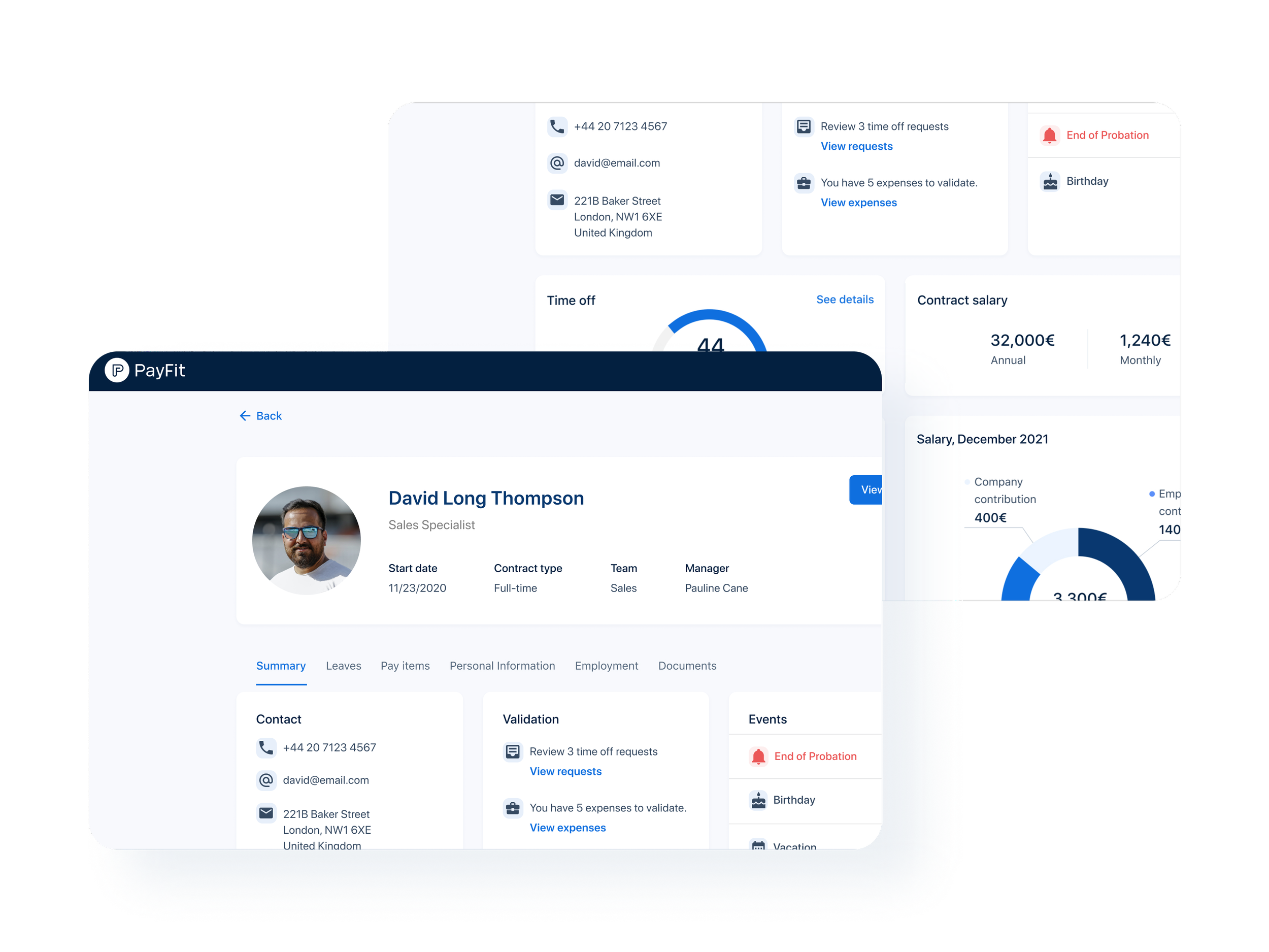
Introducing the new Employee Summary
Catherine can now view all the employee info she needs to do her daily job in one space.

Making it into reality

Since this issue we were working on was a very important one for our customers, and as mentioned before that we were losing deals, it was very important to bring impactful solutions fast so we made this impact vs effort map.
This helped us plan our MVP, where we would be working on the areas starting from the top on the left to right (high impact + parts that are needed the soonest).
Not everything went as planned
There were a few challenges that we have faced during this project. But the biggest one was aligning with many teams and finding the right point of contact to be able to retrieve the right data.
What we will work on to avoid for next time:
We made a ‘directory’ that displays who is the owner for certain topics and contact for any help easily
Sharing early on with a visual map to show our progress in the project
We love learning!
-
39 active views per day
includes all the beta testers, some are not daily users
-
4.5/5 find it useful
users found this Employee Summary easy to use
-
3.7/5 find all the info they need
some information like “Time off” needs to be improved
-
220 beta testers
in the past 30 days